John Paul Jones (Feb 2020)
The Rum is based on John Paul Jones (JPJ), a Scottish-born naval officer. Serving in the Scottish, American and Russian Navy, JPJ's life took many turns. He was a notorious risk taker and a ruthless commander making him widely feared by the British, who's navy was put to shame from the defeats it suffered against a smaller American fleet under JPJ's command. We wanted a design that would capture this sense of danger, adventure, and elusiveness.
When I was approached for this project the team had decided the name and their request was for a design that would incorperate JPJ's naval jacket as a the leading element.
Heritage and 'a modern twist'
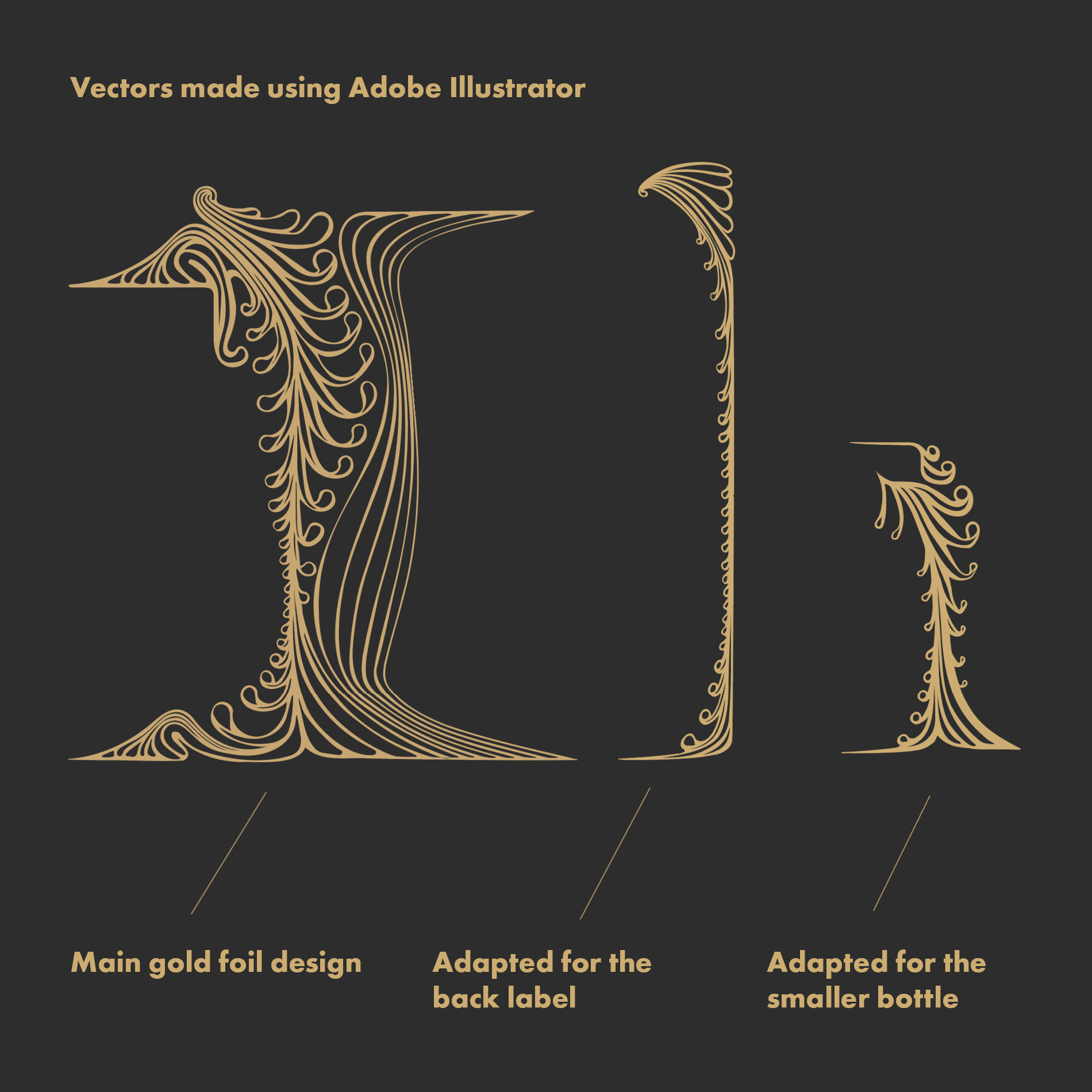
The biggest challenge was balancing the old and new styles to represent JPJ's history with what Ollie, the Co-founder and Director, described as 'a modern twist'. For heritage I knew I wanted to include some detailed ornementation similar to that seen on JPJ's naval jacket and on the architecture of ships in the 18th Century. I designed these to be loosely reminiscent of seaweed - a unique ingredient in the Rum. I knew I didn't want to purchase stock patterns that often get used with little consideration to a design's composition, instead I wanted it to be clear that these gold ornamental elements were bespoke to the brand by having them closely wrap around the contours of the label shape and creating a frame for the text and Jacket.
The modern aspect proved tough to find. Initially, my designs for the jacket looked unfocused and too detailed to work as an effective centrepiece for the design. Though I had poured hours of time into these illustrative designs, it became clear that this wasn't the best option for this brand. During a tough time on this project, the answer became clear to me - the Jacket should be a minimal, modern vector logo giving it the modern slant needed without interfering with the traditional aspects.
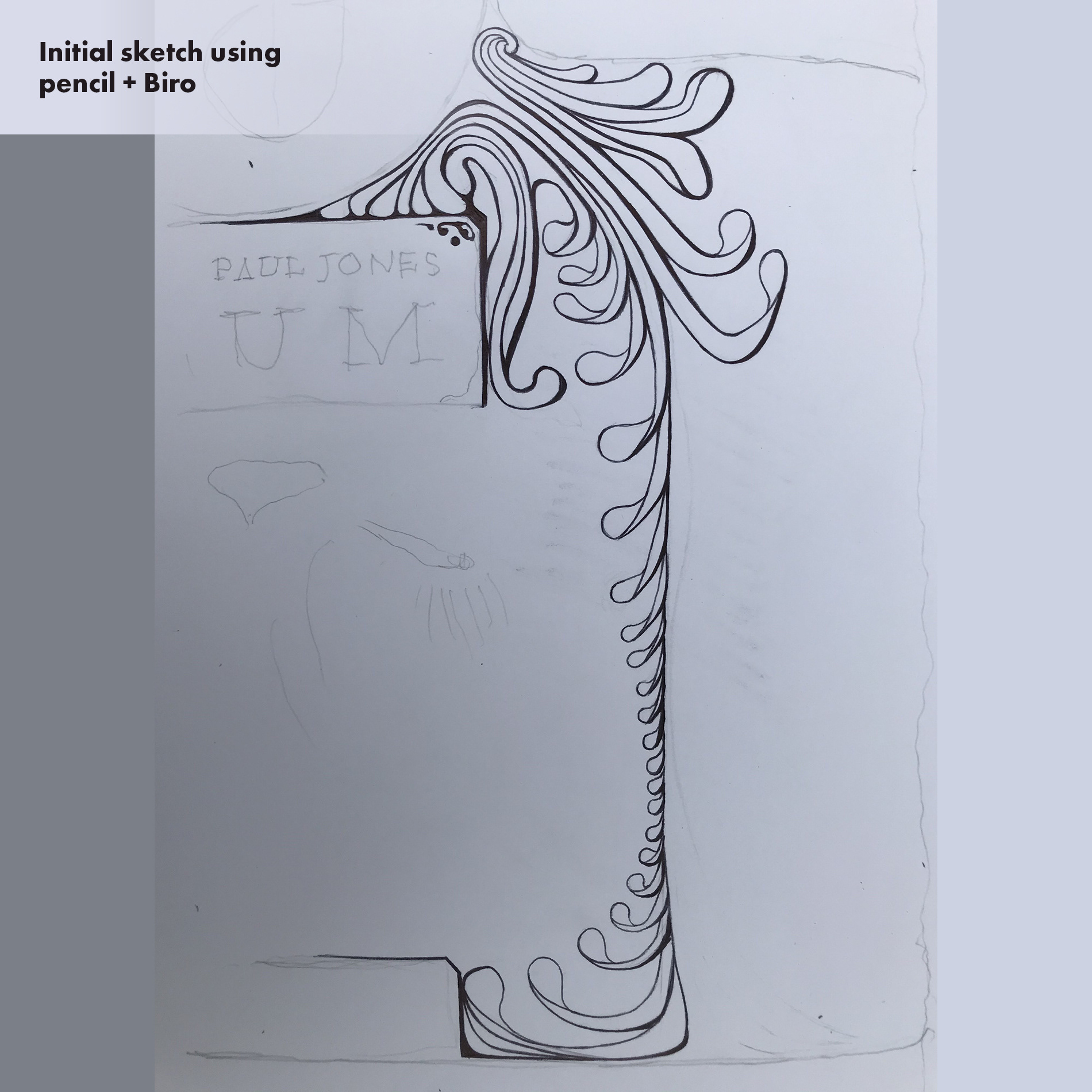
Both the logo and the decorative ornaments started off as drawings on paper. I photographed them and refined them further in Photoshop, and finally Illustrator to make the vector that was used for print. You can see the raw sketches below.
The initial design options for this were more detailed/illustrated:
Draft sketches for a vector logo:
Drafting ideas for layouts:
Options I presented for a monogram logo:
The gold foil elements started off as a drawing on paper. I then refined this using Photoshop and finally, Illustrator to make the vector for print.
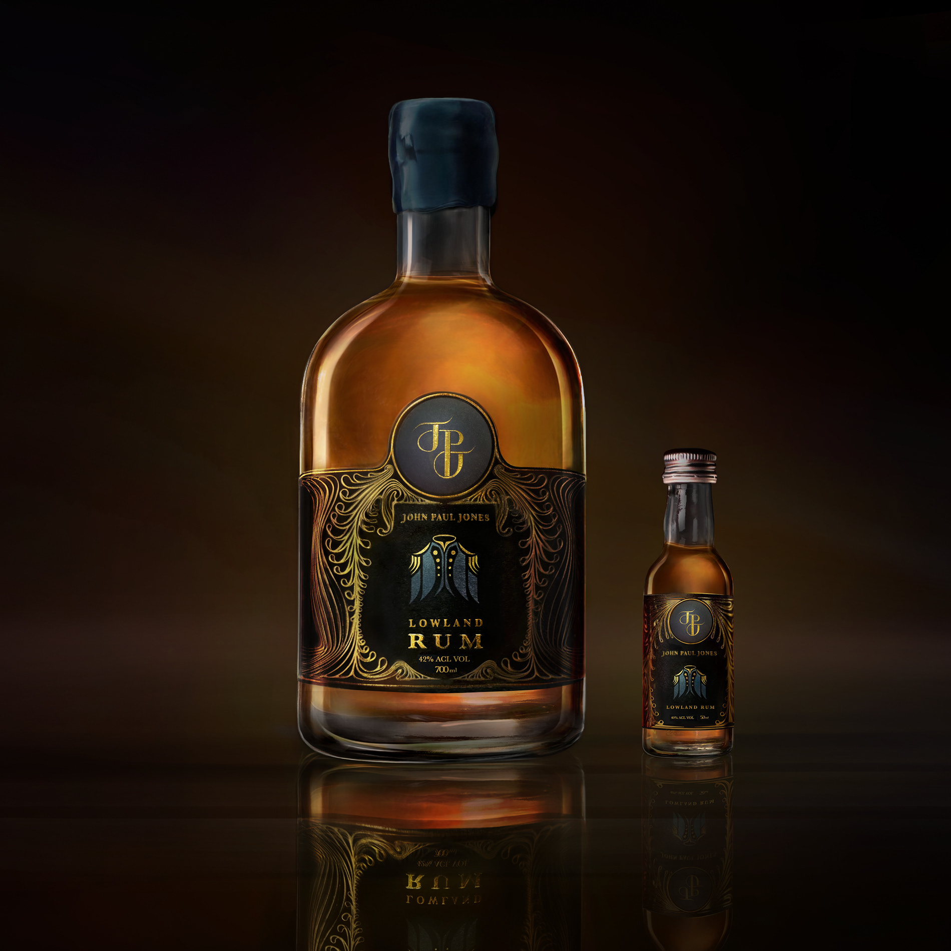
Some final design options from which the client used to get external feedback and test people's preferences:
I love Iconography. After the project was delivered I made these as practice.

